The Beauty Dish
- Misuzu

- Mar 30
- 5 min read
Hello and Happy Monday :)
This week I'm bringing you some images from a workshop I did with Dave Edkins a few weeks ago that revolved around the beauty dish. I love the beauty dish because it gives such striking images (as you will see in a moment.) If you're a photographer and you've never played around with a beauty dish, then I strongly recommend giving it a try.
A beauty dish is a studio lighting modifier that gives a high contrast result, especially when used with a honeycomb grid which is my favourite way to use it. The lighting is very hard and direct so it requires a lot of experimenting to get just right... but when you do, you end up with some stunning images.
The images in this post were taken by Dave Edkins and I will show you some of my edits and some of Dave's (I'll let you know when it's one of Dave's as there's more of my edits in this post). As always, these were captured on Dave's Nikon D850. Here are the images:
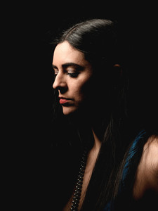
Portrait
The beauty dish gives stunning light for portraits. This style of lighting always reminds me of the classic Hollywood style portraits: I think that's why I love it so much, because it's extremely striking and impactful. I think it's also worth noting here that all of these images were taken on a white background. This shows just how quickly the light falls off and how directional it is since the background isn't lit at all when you're shooting close in like this. Here are two portraits that I edited:


Fashion
I've had this dress for a very long time and I'm still not bored of using it because it looks so glamorous, and definitely suits this style of lighting. In this first image, you can see the spotlight effect you can get with the beauty dish without the honeycomb grid on (so the light spreads out a lot more), and it worked really well with a seated pose. I think the second image here is my favourite from this entire post:


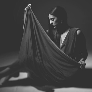
Dave's Fashion Edits
Here are some stunning edits from Dave of the seated poses. They all looks so dramatic, which is what the beauty dish does best. In these images, I had the dress unwrapped and used the material draped around me, which adds to the emotion of these images:


Monochrome
Black and white edits works really well with the beauty dish. Again it's echoing that Hollywood vibe, especially when looking towards the light rather than at the camera. These images were also taken with the dress unwrapped as above, and it makes these images feel a lot more emotive (especially in this first one).


Colour Vs Black and White
Now I'm going to bombard you with some colour vs black and white comparisons of some beauty dish portraits. These are all shots where I couldn't choose between the two versions (if you're a regular here, you'll know this is totally a thing with me). I struggled so much to choose between colour and monochrome for these because I love how the colour versions capture my skin tone and how it contrasts with the colour of my dress. But then the black and white versions have that Hollywood feel to them that I keep banging on about. So here are both versions for you to make up your own mind.
This first one is a typical Misuzu pose. I'm aware I do this pose an awful lot but it looks so good (to me, anyway).


I love the intensity of the stare on this next one. I feel like it has a lot of femininity to it and is quite empowering, while still looking incidental and not overly posed (which I do try to achieve in my work, especially for portraiture like this).


This image is one where I'm definitely more on the side of monochrome for the Hollywood reasons... but again, the colour of the dress is what makes me torn between which one I actually prefer.


I went for a different editing style on this next one where I didn't play on the contrast as much for the monochrome version and it completely changes the vibe compared to the previous image: it feels a lot softer and less dramatic.


And to finish up the colour vs black and white edits that I did, here is a shot that feels really feminine:


Here is the same shot but one of Dave's edits where he chose a closer crop. This is why I love comparing our edits, because sometimes we both have a completely different vision when it comes to the editing process. Sometimes the finished edits are very similar and I love that, but I also love it when they're so wildly different. It shows just how much the editing process can vary the end result.

Dave's Colour Vs Black and White
Dave often sends me edits with a colour and a black and white version of certain shots. This first shot is one that I edited and showed you at the very beginning of this post (my edit had a pinkish hue to it and wasn't quite as contrasty). I really love how Dave has chosen to edit this image and it works really well in black and white as well as colour:


Here is another similar shot, but with me looking up towards the light. When using the beauty dish, small changes in pose can drastically change the result because of how directional the light is. As a photographer, it's really important to keep checking your images on the back of the camera as you go to make sure you're still getting the images you want. As a side note, I'd also recommend moving around and changing your perspective as that's how you get the particularly amazing images (and some that might not work as well, but unless you try, you'll never find out).


Outtake
Of course, you know I love ending on an outtake so here it is... a beauty dish outtake:

And that's all from me for today. If you're not already signed up to my site, you can do so for free and leave a comment below to let me know if you have anything specific you think I should write a blog post about. You can also subscribe as a member from just £5 a month and get access to the monthly members only blog posts.
Anyway, I hope you have a wonderful week and I look forward to sharing more with you next Monday.
Misuzu x


One flash unit and a beauty dish makes for a good day's shooting, I feel. As these pictures demonstrate.
A really interesting read and some incredible images! I normally favour monochrome as an overall style but with the majority of the images in this post, I'm actually drawn more to the colour versions because the way the different colour tones in the image pop and contrast with each other under the direct light is incredibly compelling and beautifully striking!